Typography
Display Headings
Headings
Heading 1
Heading 2
Heading 3
Heading 4
Heading 5
Heading 6
Body
Lorem ipsum dolor sit amet, consectetur adipiscing elit. Suspendisse varius enim in eros elementum tristique. Duis cursus, mi quis viverra ornare, eros dolor interdum nulla, ut commodo diam libero vitae erat. Aenean faucibus nibh et justo cursus id rutrum lorem imperdiet. Nunc ut sem vitae risus tristique posuere.
Block Quote
- Sample text is being used as a placeholder for real text that is normally present.
- Sample text is being used as a placeholder for real text that is normally present.
- Sample text is being used as a placeholder for real text that is normally present.
- Sample text is being used as a placeholder for real text that is normally present.
- Sample text is being used as a placeholder for real text that is normally present.
- Sample text is being used as a placeholder for real text that is normally present.
Body Styles
text-lowercasetext-nowrapText Alignments (Responsive, Mobile First)
Colours
Text Colours
Background Colours
Paddings (Responsive, mobile first)
Utility spacing system - padding classes.
[padding-direction] + [padding-size/4].
e.g.
- pt-1 = 4px
- pt-2 = 8px
- pt-3 = 12px
- pt-4 = 16px
Available directions
- pt: padding-top
- pb: padding bottom
- pl: padding-left
- pr: padding-right
- px: padding-left and padding-right
- py: padding-top and padding-bottom
Responsive Options
- pt-0: Mobile and up
- pt-sm-0: Horizontal Mobile and up
- pt-md-0: Tablet and up
- pt-lg-0: Small Desktop and up
- pt-xl-0: Large Desktop and up (1280px +)
- pt-xxl-0: Extra Large Displays (1440px +)
Margins (Responsive, mobile first)
Utility spacing system - margin classes.
[margin-direction] + [margin-size/4].
e.g.
- mt-1 = 4px
- mt-2 = 8px
- mt-3 = 12px
- mt-4 = 16px
Available directions
- mt: padding-top
- mb: padding bottom
- ml: padding-left
- mr: padding-right
- mx: padding-left and padding-right
- my: padding-top and padding-bottom
Responsive Options
- mt-0: Mobile and up
- mt-sm-0: Horizontal Mobile and up
- mt-md-0: Tablet and up
- mt-lg-0: Small Desktop and up
- mt-xl-0: Large Desktop and up (1280px +)
- mt-xxl-0: Extra Large Displays (1440px +)
Display Properties (Responsive, Mobile First)
For further reading please refer to https://getbootstrap.com/docs/4.0/utilities/display/
d-line text - Sets the element to behave like an inline element
d-line text - Sets the element to behave like an inline element
d-inline-block text - The element still appears on the same line as other inline or inline-block elements, but unlike d-inline, you can set its width and height.
d-block text - The element takes up the full width of its container (100% width) by default. It starts on a new line, pushing any content before or after it onto separate lines.
d-flex - This enables a flexible layout structure, allowing you to align and distribute space among child elements efficiently. Flexbox is highly useful for creating responsive designs and complex layouts without using float-based or block-based methods.
Hiding Elements (Responsive, Mobile First)
Flex Properties
Quickly manage the layout, alignment, and sizing of grid columns, navigation, components, and more with a full suite of responsive flexbox utilities. For a more detailed explanation please refer to https://getbootstrap.com/docs/4.0/utilities/flex/
Flex Behaviours
Applies a flexbox display to an element, enabling flex container behavior.
Applies flexbox display on small screens (≥576px) and up.
Activates flexbox display on medium screens (≥768px) and up.
Applies flexbox display on large screens (≥992px) and up.
Activates flexbox display on extra-large screens (≥1200px) and up.
Flex Direction
Set the direction of flex items in a flex container with direction utilities. In most cases you can omit the horizontal class here as the browser default is row.
Arranges flex items in a horizontal row within a flex container. (browser default)
Arranges flex items in a horizontal row but in reverse order, placing the last item first and the first item last.
Arranges flex items in a vertical column within a flex container.
Arranges flex items in a vertical column but in reverse order, placing the last item at the top and the first item at the bottom.
Justify Content
Use justify-content utilities on flexbox containers to change the alignment of flex items on the main axis (the x-axis to start, y-axis if flex-direction: column). Choose from start (browser default), end, center, between, or around.
Aligns flex items to the start of the flex container (left for LTR layouts).
Aligns flex items to the end of the flex container (right for LTR layouts).
Centers flex items horizontally within the flex container.
Distributes flex items evenly, with space between them and no space at the start or end.
Distributes flex items evenly with space around them, including space at the start and end.
Align Items
Use align-items utilities on flexbox containers to change the alignment of flex items on the cross axis (the y-axis to start, x-axis if flex-direction: column). Choose from start, end, center, baseline, or stretch (browser default).
Aligns flex items to the top of the flex container.
Aligns flex items to the bottom of the flex container.
Centers flex items vertically within the flex container.
Aligns flex items along their baselines within the flex container.
Stretches flex items to fill the height of the flex container.
Align Self
Use align-items utilities on flexbox containers to change the alignment of flex items on the cross axis (the y-axis to start, x-axis if flex-direction: column). Choose from start, end, center, baseline, or stretch (browser default).
Aligns flex items to the top of the flex container.
Aligns flex items to the bottom of the flex container.
Centers flex items vertically within the flex container.
Aligns flex items along their baselines within the flex container.
Stretches flex items to fill the height of the flex container.
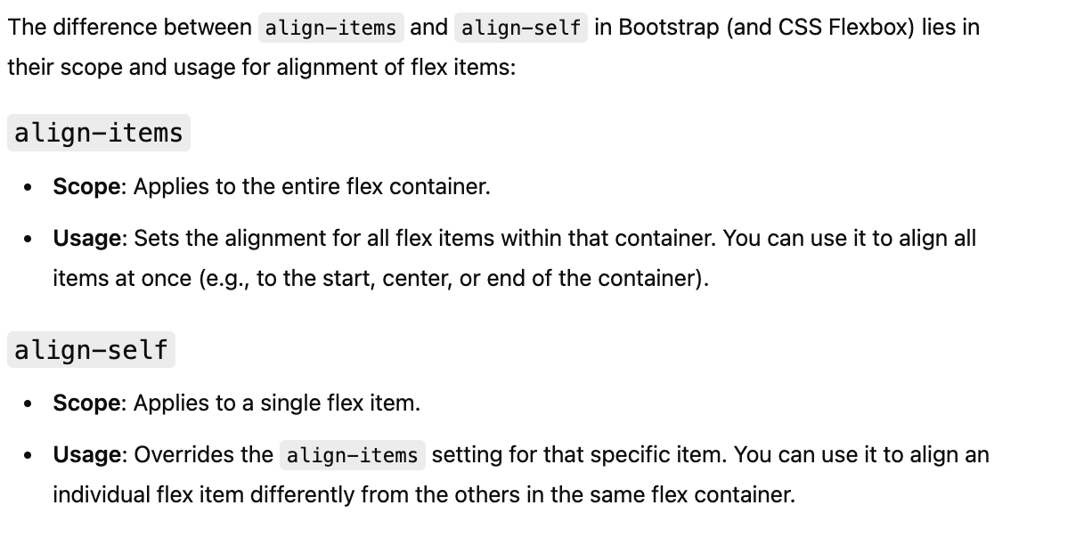
Difference between align-items and align-self
Layout

Rich Text
Heading 1
Heading 2
Heading 3
Heading 4
Heading 5
Heading 6
Lorem ipsum dolor sit amet, consectetur adipiscing elit, sed do eiusmod tempor incididunt ut labore et dolore magna aliqua. Ut enim ad minim veniam, quis nostrud exercitation ullamco laboris nisi ut aliquip ex ea commodo consequat. Duis aute irure dolor in reprehenderit in voluptate velit esse cillum dolore eu fugiat nulla pariatur.
Block quote
Ordered list
- Item 1
- Item 2
- Item 3
Unordered list
- Item A
- Item B
- Item C
Bold text
Emphasis
Superscript
Subscript
Forms
Heading 1
Heading 2
Heading 3
Heading 4
Heading 5
Heading 6
Lorem ipsum dolor sit amet, consectetur adipiscing elit, sed do eiusmod tempor incididunt ut labore et dolore magna aliqua. Ut enim ad minim veniam, quis nostrud exercitation ullamco laboris nisi ut aliquip ex ea commodo consequat. Duis aute irure dolor in reprehenderit in voluptate velit esse cillum dolore eu fugiat nulla pariatur.
Block quote
Ordered list
- Item 1
- Item 2
- Item 3
Unordered list
- Item A
- Item B
- Item C
Bold text
Emphasis
Superscript
Subscript